|
For all your safety sign needsOpen till late - 0208 133 6709 |
|
|
For all your safety sign needsOpen till late - 0208 133 6709 |
|
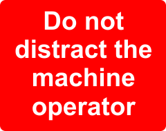
When you're making your own bespoke safety sign, be sure to use the correct colouring and pictogram that is suitable for the message you are trying to convey. PROHIBITION SIGNSThese are signs that are prohibiting people for carrying out a certain action. For example a sign that instructs 'Do not distract the machine operator' would be on a red backround (if no pictogram is used) or a prohibition circle with the text underneath as in these examples:
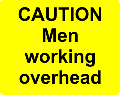
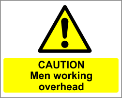
CAUTIONARY SIGNSThese are signs that warn people of a potential hazard. This could be an uneven surface, slippery floor or any other hazard that would put employees or the public in danger. The colour for these signs is yellow. Here are a couple of examples:
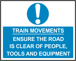
MANDATORY SIGNSThese are signs that inform people that an action MUST be performed. The colour for these signs in blue. Here are a couple of examples:
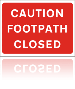
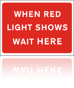
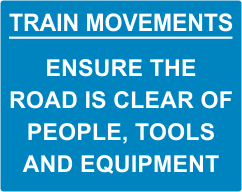
COLOURS FOR BESPOKE ROAD SIGNSThe colours for road signs are slightly different. Whereas red is the colour for prohibition on a safety sign, for a road sign, red is generally used as a colour for warnings and instructions such as:
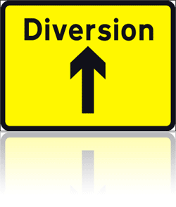
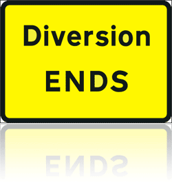
Yellow is generally used for signs giving directions such as:
CONCLUSION Now go to the sign designer page to design your own safety sign
Safety Signs |
Road Signs |
Stanchion Signs |
Temporary Road Signs
All major credit cards accepted. Thawte approved and secure site.  Safety Signs - Owned and Operated by BCW Office Products LTD registration 05693956, VAT 900 3466 61.
(c) 2017 BCW. Website design Crawshay Gallery / Number 6 Consulting LLC All rights reserved. |
 OR
OR 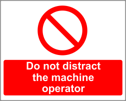
 OR
OR
 OR
OR